
42. The Design Process & how to hire me: SPCA poster story
- Apr 14
- 9 min read

At a dinner party recently, I was asked to explain the design process for my ACCCE social impact projects. Between fork clanks and soft music, I did my best to share the gist of it all. And in the process I realized the design process can seem a bit confusing. So in this blog post, I'll share a bit about the design process through the story about a poster series I created last year for the local Windhoek SPCA. You'll learn how projects get started, what you can expect from a design experience and how to hire me - plus cute little doggo illustrations as we go along!
...
A quick introduction - SPCA is the Society of Prevention of Cruelty to Animals and it exists almost worldwide as an NGO that cares for and rehomes stray or abandoned pets. I love animals and enjoy a bit of volunteering, so I signed up as a volunteer as soon as we arrived in country. And I've been on the regular volunteer roster at the SPCA ever since! (If you want to read more about my volunteering, you can head to blog post No 22 Dogust from 2023.)
Oh, and if you don't know me already, hi, I'm Smarti and I'm an illustrator/graphic designer. I believe in the power of social impact so I offer my services at reduced rates to NGOs and social impact initiatives under the ACCCE umbrella (Animals, Conservation, Culture, Community, Environment). Sometimes the funding is paid forward from other willing clients, which just further reinforeces the idea that we can all do good when we work together.
I rock up to the SPCA every week to volunteer for a couple of hours. I like to suit up in flight suit coveralls and bring treats in a small waist pack. Once inside, I check in to as many kennels as I can. There are over 20 kennels fit for volunteer access, and each one has two dogs in them. So I let myself into their kennels and cuddle, train and play with these puppers so they can get more habituated to humans before adoption.
At the end of my session, I fill in a time log at the front office and the staff sign off on the hours that I served. (They use that info later for statistics, fundraising, etc.) This is also how the staff gets to know the volunteers and their skillsets. (Fun fact, last year I clocked in over 200 hours so the dog director gave me a puppy perk. She let me "borrow" a soft, white 5-month old rescue named Lulu to attend puppy school so I could learn more training techniques. Lulu got adopted a few months later and I hear she's doing really well in her new family!)
Over the year as I passed in and out of the office, the director and I would meet and chat casually. Eventually, she pulled me into her office to talk about my creative work. I got to share some design stories and walk her through my portfolio on my website. As her tenure was coming to a close, she told me about a dream design project she had been hoping to create and how I would be the perfect designer for it! I told her I would be excited to hear more and asked her to send me an email to formalize the project hire request.
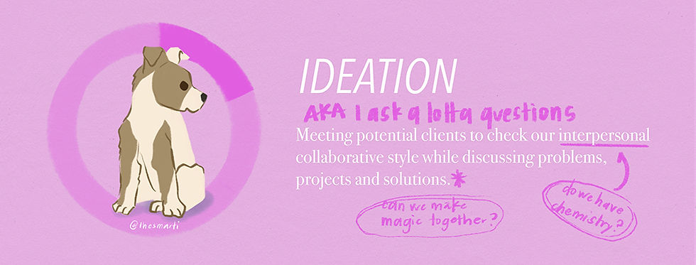
We had a first social meeting, just going for a hike with her pup so we could get to know each other. (I'm very lucky - I always seem to have fun social calls with my clients.) From there we started to talk about what the project could be. I asked her all the common questions:
who is it for?
what is the purpose?
why is it important?
when does it need to be finished?
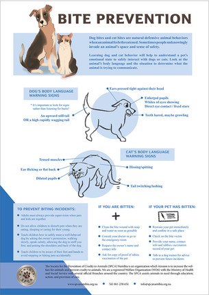
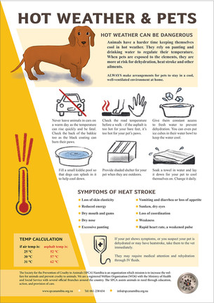
She decided to develop a public awareness pet care campaign series, printed as posters or in the SPCA newsletter. She listed out a series of topics that would be the most important to share about the care of common diseases and specific concerns to pet-life in Namibia - ticks, rabies, etc. But also info about how to care for outdoor pets with the summer heat and winter cold specific to desert life.
She emailed me some previous poster designs, some content from other SPCAs in other countires and together we nailed down the reason for this project: to educate pet-owners and help SPCA Windhoek elevate their authority and integrity in the country. On the visual front, the key to creating this authority and integrity is through quality info, uniform poster design and cohesive branding.

Once the contract was set and the deposit paid, I moved forward into the research phase. To start, I dig into the visual pieces provided - like the posters. I spend a lot of time analyzing all the elements - typography style, the colors, layouts, language tone, etc. I like to write down the impression that the choices create so I can make sure that a) they are being consistent throughout the branding and b) I can see the patterns I need to follow to make the next series match the branding.
This is also where I start to find anomolies with clients, specifically "who they think they are" vs "how they actually present themselves." Sometimes I have to ask my clients some hard questions about visual identity. It often takes introspection and an understanding of visual nuances. Certain colors, illustration styles or language change the branding tone. So I try to be gentle, helpful and educational as they figure out what they decide what they need to express with their branding and/or the project's visual identity.
Alongside this, I also had to start compiling the copy text. Normally for graphic design projects, the clients give you copy text (their info, their sales pitch, their language) and you paste it in to the poster/brochure/grant proposal, etc. But for this illustrated poster series the director hired me to also do the research to build up the copy text.
Although tedious, it was actually helpful for me to do the research so I could brainstorm what things would be appropriate to illustrate for each of the poster topics. I read veterinarian medical articles, gleaned over wikipedia disease listings, watched videos (seeing animals suffer from diseases was heart-breaking) and searched for pictures and reference materials. I compiled all of the information in a google doc on each of the 12 separate topics and sent it to the director. Once she sent some edits, I was able to move forward with the design concepts.
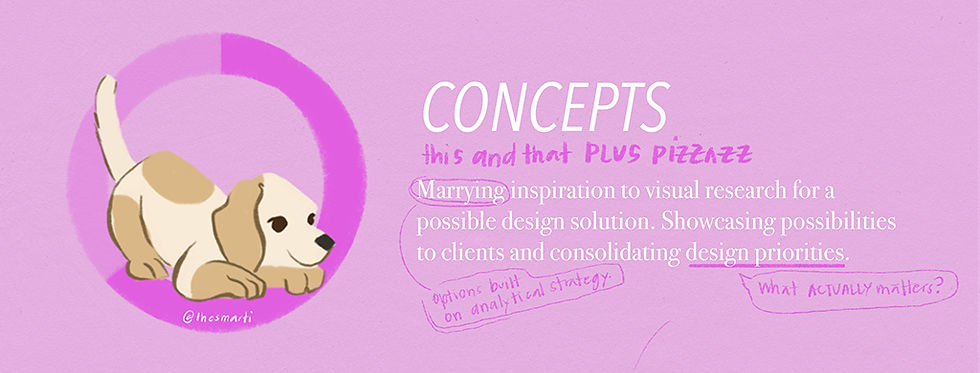
Finally, choosing concepts - where the inspirational brainstorm begins! Yuppee! I typically have an idea of what I think will work - in this case two-tone designs. But I also love to scour pinterest to find some inspiration. Sometimes these inspo pieces have NOTHING to do with the project. But something in the search helps to unlock creative space in my brain. An illustration style, a color palette, a funky layout. That helps me break out of the routine and inspires ideas to make it extra special.
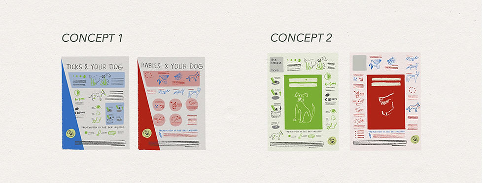
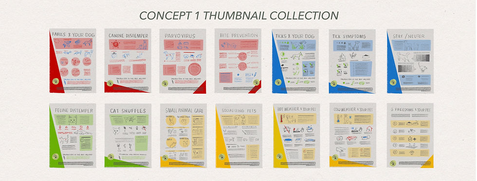
I crafted two concepts in two thumbnails each - four posters in total - to send to the director. The first concept was designed so the poster could be folded up into a squarish pamphlet, or cut up into bite-size pieces for social media IG. The second concept mimicked a colored angle element used in other branding material to give a slanted edge to the poster design. The director decided to go with the second concept to reinforce the branding material. So I fleshed out 10 posters remaining in the series into thumbnail sketches in the same style.
I'll be honest, at the end of this phase I hit a bit of burnout. Building the copy text was draining, and although the concept design work is invigorating, it was a lot of work to build out the rest of the posters. Now, past-Smarti would just muscle through the pain, but I've learned that my inner muse comes back quicker when I honor deep rest. So I try to ask for time extensions when I feel tired like this. (Note to self: this is a pattern. I need to start building a rest buffer between concept design and final deadlines on big projects like this to give space to decompress between intense phases. Maybe 20-30% more time.) Thankfully the director was fine with me needing to pause the project for some rest, and she agreed to reset the contract terms and deadlines.

Once revived, I set up the poster files in Adobe Indesign software and started to assemble the color block layouts and text boxes. While some of the layouts were similar, each poster was different. Some of the posters had side angles, or circles, or blocks for texts, so I often had to ignore the grid or shift text to fit around the space blocked out for the illustrations. It took a lot of jiggling to get each poster to look tidy and organized.
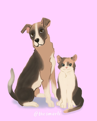
I decided to give each poster one main color illustration which meant sketching, painting and finalizing 12 drawings in full-color. I specifically chose to illustrate some of the local dogs and cats that were listed at the time in the SPCA. There are so many cute pets that are rescued in the system, so I pinned the adoption page on my browser as a helpful reference to understand body shapes, fur patches, ear heights, etc. throughout the sketch phase. The shapes and bodies of dogs and cats change from breed to breed. So there were a lot of different shapes to try before figuring out the best shapes and poses.
The pet painting process took a learning curve. I've never painted fur before so I got quite carried away using several different techniques to make the fur patches believable. In the end I had to pull back because the painting technique mismatched with the comic illustration style that I was able to achieve. So I scaled back the details and used a blending brush instead to create outlines for body shapes. That seemed to do the trick. Once I nailed down at least three of the color illustrations, the process became easier and I painted each successive one faster.


The last detail to sort were the 63 small black ink sketches I designed for the infographic details. A grainy pencil style felt right so I could give a personalized texture to the images and soften the info-heavy posters . Thankfully, I already had hand-drawn sketches from the thumbnails to reference so I quickly whipped up the last of the sketches in a couple of hours! I spent a day or so lining up all of the illustrations with the text.
After all the work it took to make the copy text and organize the graphic design elements of poster layout, I was surprised at how fast the illustrations came together. Maybe it was using a different part of my brain? Maybe I'm happier doing illustration work? Maybe it was just easier for some reason. Who knows. All the same, I'm grateful for the all the time and dedication I put in to illustration skills so that they are easier and easier to access.
The director and did 2 rounds of live edits and 1 final email edit list before the series was complete. For the live edits, we set up a Zoom call and I shared my screen so we could go through each poster and revise things on the fly. She had already marked up all the edits we needed to make, so we just went through her list. We edited texts, fixed illustration colors, changed sizes and layouts of the sketches, added in transparency layers, and reformatted the bottom branding text.
Once the final edits were complete, I packaged the file in an Adobe Indesign folder and sent it via WeTransfer so the director could download the files directly to their servers. The director sent me the final payment for the work and prepared a review of the process and my services. She was even kind enough to send a reference to help me connect to another NGO who is interested in my work!
These posters appear in the SPCA monthly newsletter as a dedicated series to share with members of the community. Although they are in full color, some of the posters have been recolored into greyscale for black and white printed versions. They weren't designed for that contrast, but they still work and I'm glad they are serving their purpose.


...
This project started after a string of casual interactions with the director. Sometimes that's how it unfolds. But projects have also started after live-draw events, illustration swaps, friend introductions and email inquiries. Each time there's a bit of a get-to-know you phase so we can determine the project and if my skill set in graphic design and illustration style are the right fit. If you're here, and you've got a project in mind, you are welcome to reach out and say hello - it could be the start of a great project.
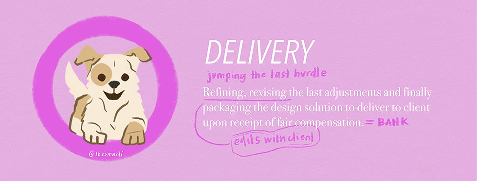
And now you know based on this project and many others on the blog,what it's like to work with me. From 1) ideation, 2) research, 3) concepts, 4) design and 5) delivery - the process is similar for each design experience. It's just the topic and breadth of the work that changes for the project and the client's needs. In this case it was a privilege to get hired to work on this poster series to support the SPCA and all the great work they do in the community!
cheers to getting hired to do good work for furry friends,
smarti

Comments