
- May 14
- 4 min read

There is a type of meditation called Vipassana which is heralded as the original meditation that the Buddha used to reach enlightenment. I have several friends who have been on Vipassana Meditation Retreats and recommended it. So as part of my self-development this year, I decided to go do a 10 day course near Cape Town. After it wrapped, I spent a lot of time trying to make sense of my experience, so I'm sharing my thoughts as a testament to my current perspective and in the hopes it will be helpful for anyone curious about it.
......
Vipassana is a meditation of awareness. It's an old technique that originated in India and then bypassed cultural evolution by being imported to Bhutan as a foreign tradition. (Ah, the sanctity of something that originated somewhere else!) Bhutanese monks protected the dogmatic practice of Vipassana for hundreds of years. The teachings eventually came to a Bhutanese businessman with Indian origins, S.N. Goenka in 1962. Goenka built a consistent teaching model in a 10 days residential program and established non-commercial meditation centers all over the world.
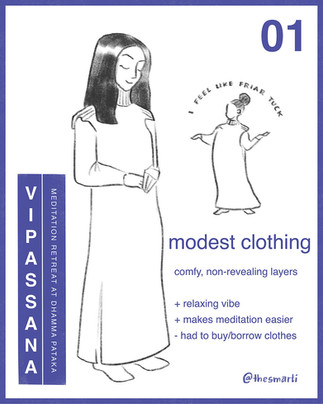
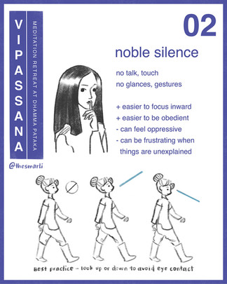
So now "Vipassana" in shorthand is known as this 10-day experience where participants learn the technique in a shared meditation hall while they room and board in simple monk-life fashion in segregated dormitories. The daily schedule is strict with meditation training starting at 0430, interspersed with meal times and rest times until the day ends at 2100. All participants agree to a modest clothing, noble silence (no writing, drawing, gestures, or glances) and staying for the full 10 day experience to learn the technique properly.
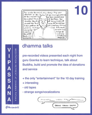
Goenka created the course with a series of his audio recordings and video recordings. The audio recordings are played during the day during meditation sessions. The video recordings are played at the end of each night as a way to explain the purpose of the process, some of the Buddhist teachings and reinforce the non-sectarian, universal results of the meditation.
In my case, the training ended just before a wild storm came through Cape Town. So on the day we were released, I spent hours walking through torrential rain, crazy wind and grey skies feeling awe-struck at how loud, noisy and overwhleming real life is. Back in my hotel room before my flight back to Windhoek, I wrote down all the different components so I could capture my thoughts on the entire experience:


Learning the technique is deceiptively simple. Sit. Breathe. Feel the sensations in the body. Good or bad - doesn't matter. Just feel the sensations in the body. So, even if you don't actually follow any of the philosophical concepts, the results (feeling more zen and less affected by things) are very comforting.
In my case, I didn't correct bad technique at the start and so the cumulative effect of 10 days of meditation training resulted in severe eye strain, migraines and sea-sickness. (It turns out I was moving my eyeballs under my closed eyelids to "track" the parts of my body so I could feel the sensations better. I even might have even been crossing my eyes at times which would explain the intensity of my eye pain!) So I finished the course encouraged and intrigued but also sad, confused and somewhat embarrassed that I was injured and in unexpected pain. (Most people are in pain from sitting for so long and not getting in movement.)
I immediately stopped doing the technique and spent the several weeks after the retreat just thinking while healing. (My eyes felt swollen and so sensitive to touch and light and the migraines persisted for a while afterwards.) Once I felt better, I shaked down every Vipassana meditator in my life, I debated wise philosophical friends, and I journalled the hell out of everything. I still desperately wanted to make sense of everything.
What I finally accepted is that while the Vipassana experience is somewhat similar for everyone, each person learns their own lessons. At the very least that was the case for everyone I spoke to who went through the 10 day course. They each had a range of self-reckoning lessons: the quality of their self-talk, their integrity, their vulnerability, their intuition, their understanding about life, their capacity for the unknown, their greater connection to humanity, etc. It gave me comfort to know that everyone comes out a bit mixed, but all seem grateful to find a technique to embody more zen in life.
Symbolically, I now think Vipassana damaged my vision (temporarily) to help me release my stubborn fear of losing control. I was literally trying so hard that I was (unknowingly) forcing my eyes which constricted my veins and tightened my scalp resulting in the intense eye pain and the migraines that followed. So I had to abandon the meditation practice at the pinnacle of the retreat experience! I had to release my internal pressure. Relax. Get some distance from the fear and shame of being out of control and let the lessons slowly come to me in their own time.
Beyond that, Vipassana also helped me broaden my perspective on mysticism, mind-body mysteries and some radically different philosophical ideas about life. After all those conversations, debates, journal entries, I eventually gave in to all of my confusing, unfinished, unresolved thoughts. I took it all in and then let it all go. I'll just accept what I can right now.
......
The vipassana meditation technique is really beautiful and transforming. Despite my own experience of pain, most people learn to use vipassana to have less suffering, less attachment and more peace, more happiness in their lives. As for me, I'm very slowly retraining my eyes in Vipassana meditation. But I'm letting it happen with more ease and less fear. I know it will help me be more present and grateful for whatever else I get to experience in this lifetime.
So, cheers to trying new things and failing and everything in between,
and may it help you in your own journey,
Smarti
- Apr 14
- 9 min read
Updated: Apr 27

At a dinner party recently, I was asked to explain the design process for my ACCCE social impact projects. Between fork clanks and soft music, I did my best to share the gist of it all. And in the process I realized the design process can seem a bit confusing. So in this blog post, I'll share a bit about the design process through the story about a poster series I created last year for the local Windhoek SPCA. You'll learn how projects get started, what you can expect from a design experience and how to hire me - plus cute little doggo illustrations as we go along!
...
A quick introduction - SPCA is the Society of Prevention of Cruelty to Animals and it exists almost worldwide as an NGO that cares for and rehomes stray or abandoned pets. I love animals and enjoy a bit of volunteering, so I signed up as a volunteer as soon as we arrived in country. And I've been on the regular volunteer roster at the SPCA ever since! (If you want to read more about my volunteering, you can head to blog post No 22 Dogust from 2023.)
Oh, and if you don't know me already, hi, I'm Smarti and I'm an illustrator/graphic designer. I believe in the power of social impact so I offer my services at reduced rates to NGOs and social impact initiatives under the ACCCE umbrella (Animals, Conservation, Culture, Community, Environment). Sometimes the funding is paid forward from other willing clients, which just further reinforeces the idea that we can all do good when we work together.
I rock up to the SPCA every week to volunteer for a couple of hours. I like to suit up in flight suit coveralls and bring treats in a small waist pack. Once inside, I check in to as many kennels as I can. There are over 20 kennels fit for volunteer access, and each one has two dogs in them. So I let myself into their kennels and cuddle, train and play with these puppers so they can get more habituated to humans before adoption.
At the end of my session, I fill in a time log at the front office and the staff sign off on the hours that I served. (They use that info later for statistics, fundraising, etc.) This is also how the staff gets to know the volunteers and their skillsets. (Fun fact, last year I clocked in over 200 hours so the dog director gave me a puppy perk. She let me "borrow" a soft, white 5-month old rescue named Lulu to attend puppy school so I could learn more training techniques. Lulu got adopted a few months later and I hear she's doing really well in her new family!)
Over the year as I passed in and out of the office, the director and I would meet and chat casually. Eventually, she pulled me into her office to talk about my creative work. I got to share some design stories and walk her through my portfolio on my website. As her tenure was coming to a close, she told me about a dream design project she had been hoping to create and how I would be the perfect designer for it! I told her I would be excited to hear more and asked her to send me an email to formalize the project hire request.
We had a first social meeting, just going for a hike with her pup so we could get to know each other. (I'm very lucky - I always seem to have fun social calls with my clients.) From there we started to talk about what the project could be. I asked her all the common questions:
who is it for?
what is the purpose?
why is it important?
when does it need to be finished?
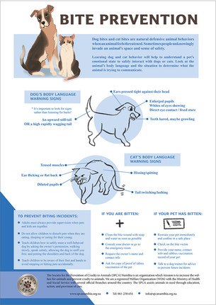
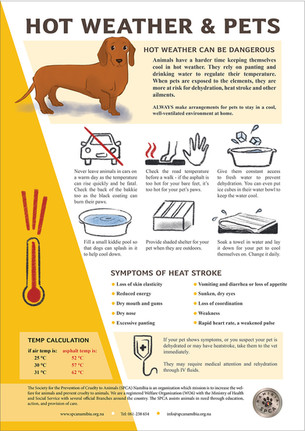
She decided to develop a public awareness pet care campaign series, printed as posters or in the SPCA newsletter. She listed out a series of topics that would be the most important to share about the care of common diseases and specific concerns to pet-life in Namibia - ticks, rabies, etc. But also info about how to care for outdoor pets with the summer heat and winter cold specific to desert life.
She emailed me some previous poster designs, some content from other SPCAs in other countires and together we nailed down the reason for this project: to educate pet-owners and help SPCA Windhoek elevate their authority and integrity in the country. On the visual front, the key to creating this authority and integrity is through quality info, uniform poster design and cohesive branding.

Once the contract was set and the deposit paid, I moved forward into the research phase. To start, I dig into the visual pieces provided - like the posters. I spend a lot of time analyzing all the elements - typography style, the colors, layouts, language tone, etc. I like to write down the impression that the choices create so I can make sure that a) they are being consistent throughout the branding and b) I can see the patterns I need to follow to make the next series match the branding.
This is also where I start to find anomolies with clients, specifically "who they think they are" vs "how they actually present themselves." Sometimes I have to ask my clients some hard questions about visual identity. It often takes introspection and an understanding of visual nuances. Certain colors, illustration styles or language change the branding tone. So I try to be gentle, helpful and educational as they figure out what they decide what they need to express with their branding and/or the project's visual identity.
Alongside this, I also had to start compiling the copy text. Normally for graphic design projects, the clients give you copy text (their info, their sales pitch, their language) and you paste it in to the poster/brochure/grant proposal, etc. But for this illustrated poster series the director hired me to also do the research to build up the copy text.
Although tedious, it was actually helpful for me to do the research so I could brainstorm what things would be appropriate to illustrate for each of the poster topics. I read veterinarian medical articles, gleaned over wikipedia disease listings, watched videos (seeing animals suffer from diseases was heart-breaking) and searched for pictures and reference materials. I compiled all of the information in a google doc on each of the 12 separate topics and sent it to the director. Once she sent some edits, I was able to move forward with the design concepts.
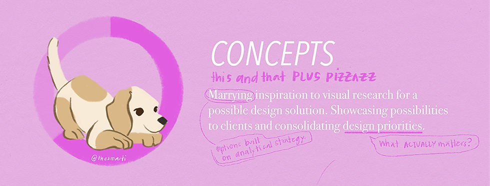
Finally, choosing concepts - where the inspirational brainstorm begins! Yuppee! I typically have an idea of what I think will work - in this case two-tone designs. But I also love to scour pinterest to find some inspiration. Sometimes these inspo pieces have NOTHING to do with the project. But something in the search helps to unlock creative space in my brain. An illustration style, a color palette, a funky layout. That helps me break out of the routine and inspires ideas to make it extra special.
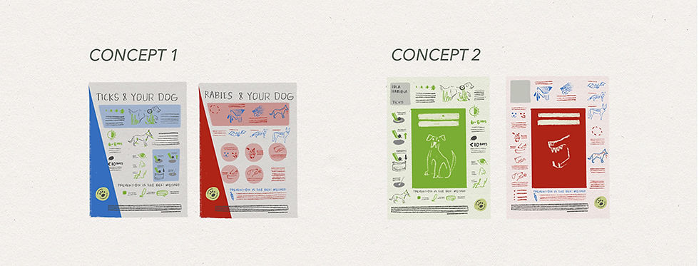
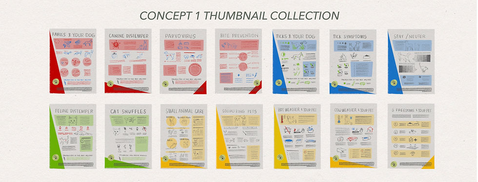
I crafted two concepts in two thumbnails each - four posters in total - to send to the director. The first concept was designed so the poster could be folded up into a squarish pamphlet, or cut up into bite-size pieces for social media IG. The second concept mimicked a colored angle element used in other branding material to give a slanted edge to the poster design. The director decided to go with the second concept to reinforce the branding material. So I fleshed out 10 posters remaining in the series into thumbnail sketches in the same style.
I'll be honest, at the end of this phase I hit a bit of burnout. Building the copy text was draining, and although the concept design work is invigorating, it was a lot of work to build out the rest of the posters. Now, past-Smarti would just muscle through the pain, but I've learned that my inner muse comes back quicker when I honor deep rest. So I try to ask for time extensions when I feel tired like this. (Note to self: this is a pattern. I need to start building a rest buffer between concept design and final deadlines on big projects like this to give space to decompress between intense phases. Maybe 20-30% more time.) Thankfully the director was fine with me needing to pause the project for some rest, and she agreed to reset the contract terms and deadlines.

Once revived, I set up the poster files in Adobe Indesign software and started to assemble the color block layouts and text boxes. While some of the layouts were similar, each poster was different. Some of the posters had side angles, or circles, or blocks for texts, so I often had to ignore the grid or shift text to fit around the space blocked out for the illustrations. It took a lot of jiggling to get each poster to look tidy and organized.
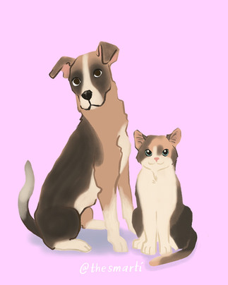
I decided to give each poster one main color illustration which meant sketching, painting and finalizing 12 drawings in full-color. I specifically chose to illustrate some of the local dogs and cats that were listed at the time in the SPCA. There are so many cute pets that are rescued in the system, so I pinned the adoption page on my browser as a helpful reference to understand body shapes, fur patches, ear heights, etc. throughout the sketch phase. The shapes and bodies of dogs and cats change from breed to breed. So there were a lot of different shapes to try before figuring out the best shapes and poses.
The pet painting process took a learning curve. I've never painted fur before so I got quite carried away using several different techniques to make the fur patches believable. In the end I had to pull back because the painting technique mismatched with the comic illustration style that I was able to achieve. So I scaled back the details and used a blending brush instead to create outlines for body shapes. That seemed to do the trick. Once I nailed down at least three of the color illustrations, the process became easier and I painted each successive one faster.


The last detail to sort were the 63 small black ink sketches I designed for the infographic details. A grainy pencil style felt right so I could give a personalized texture to the images and soften the info-heavy posters . Thankfully, I already had hand-drawn sketches from the thumbnails to reference so I quickly whipped up the last of the sketches in a couple of hours! I spent a day or so lining up all of the illustrations with the text.
After all the work it took to make the copy text and organize the graphic design elements of poster layout, I was surprised at how fast the illustrations came together. Maybe it was using a different part of my brain? Maybe I'm happier doing illustration work? Maybe it was just easier for some reason. Who knows. All the same, I'm grateful for the all the time and dedication I put in to illustration skills so that they are easier and easier to access.
The director and did 2 rounds of live edits and 1 final email edit list before the series was complete. For the live edits, we set up a Zoom call and I shared my screen so we could go through each poster and revise things on the fly. She had already marked up all the edits we needed to make, so we just went through her list. We edited texts, fixed illustration colors, changed sizes and layouts of the sketches, added in transparency layers, and reformatted the bottom branding text.
Once the final edits were complete, I packaged the file in an Adobe Indesign folder and sent it via WeTransfer so the director could download the files directly to their servers. The director sent me the final payment for the work and prepared a review of the process and my services. She was even kind enough to send a reference to help me connect to another NGO who is interested in my work!
These posters appear in the SPCA monthly newsletter as a dedicated series to share with members of the community. Although they are in full color, some of the posters have been recolored into greyscale for black and white printed versions. They weren't designed for that contrast, but they still work and I'm glad they are serving their purpose.


...
This project started after a string of casual interactions with the director. Sometimes that's how it unfolds. But projects have also started after live-draw events, illustration swaps, friend introductions and email inquiries. Each time there's a bit of a get-to-know you phase so we can determine the project and if my skill set in graphic design and illustration style are the right fit. If you're here, and you've got a project in mind, you are welcome to reach out and say hello - it could be the start of a great project.
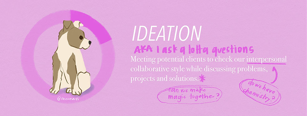
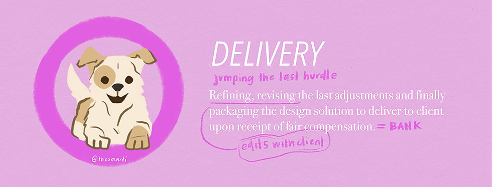
And now you know based on this project and many others on the blog,what it's like to work with me. From 1) ideation, 2) research, 3) concepts, 4) design and 5) delivery - the process is similar for each design experience. It's just the topic and breadth of the work that changes for the project and the client's needs. In this case it was a privilege to get hired to work on this poster series to support the SPCA and all the great work they do in the community!
cheers to getting hired to do good work for furry friends,
smarti
- Mar 14
- 4 min read

I love designing games and in the past couple of years, I've personalized two board games for friends that I'd love to share here. The design process is very enjoyable because each personality requires a different game and the process of crafting a game feels like an intimate dive into their lives. Read on to learn how I interview, brainstorm and designed these board games.
...
I have already shared before how I am a designer who enjoys making card games (here) and treasure hunts (here and here.) So it's no surprise that I would eventually get around to crafting personalized board games. Both of these games came about in anticipation of special events. I like how each board game honored the person in a very unique way.

Arpita Surprise game design © thesmarti
One of the darlings in my friendship circle loves prank surprises. She's incredibly gentle and sweet, so it was a bit of a shock to learn she finds pranks hilarious. (Think pies in face, midnight birthday pajama pop-ups, surprise visits, throwing a bucket of ice on a friend, etc.) To be honest, pranks make me nervous and sad, but I don't want to yuck anyone's yum and I can respect that it's integral to her cheeky personality.
For her birthday game board, we did a long interview with a whole range of questions about her life, her best stories and her favorite pranks. She pulled back the layers a bit to explain why she finds pranks special: it's the ultimate novelty of the unknown. Reactions and hidden feelings are revealed and the prank lets her share very random moments with family and friends.
After the interview, the game board idea came together rather quickly. A simple path alternating pick-up card for three different stacks - choices, stories, and pranks. Choice cards featured multiple choice answers to guess her likes/dislikes. Story cards listed the components of her best life stories so the player could string a convincing story together and guess the truth of the actual situation. Prank cards featured silly pranks that either propelled the player forward or backward. I made the prank cards gentle (toy soldiers in bed, googly eyes on every picture frame) and they were sweetly funny.
To decide on the card designs I asked Arpita to take a photo of her favorite sari designs. She sent me a bunch of different pictures and I pulled out a color palette from the references. I drew in and colored the game path, a space for cards, and personalized a little portrait of Arpita for the board. The cards were quickly lined up in InDesign with prompts straight from my interview notes. Print, cut, stack and the game board was ready in time for her birthday dinner. In hindsight. I would probably rearrange the path tiles for a bit more variety in the path. (For some reason the dice kept falling on the same number so we all had a bit of deja vu with the game.) In the end, the best surprise was that the person who got prank cards the most was the one who eventually won the game! Pranks for the win, eh?
...

How Well Do I Know Dennis game design © thesmarti
The second game came about when a friend called me up to help design something for her husband. She was arranging a tour through Namibia for his MBA colleagues who are known for sharing deep stories and vulnerable moments (hooray for male emotional intelligence!) So she asked me to make a card game that they could play one night together.
I was so intrigued by the idea of a circle of men being interested in each other's stories. (Male friendship research shows very low rates of intimacy in comparison to women friendships.) So for this special group of friends, I thought a board game about his life would be ideal.
Since the board game was a quick surprise, I had very little time to interview. So instead of specific questions, I quickly whipped up a list of 50 open-ended questions and emailed them to my friend so she could cross of the ones she didn't like. The questions ranged from adventures in his childhood, his school years, his adult life and even his current job. The goal of the game would be to see which friend actually knew him the best and could answer the open-ended questions the best.
Then I designed the board with a line of path tiles, a quick portrait illustration, and a block for the cards. The cards were copy-pasted from the email with a simple back cover block color design with the game name. Print, cut, fold and packaged in an envelope. Quick, easy, simple and easy to travel with. The game itself was played at a camp site and my friend told me later that it was a perfect end to a lovely road trip for this friendship group.
...
Making a custom board game is a fun way to get close, vulnerable and playful with friends. It helps to build new memories and unlock new levels in your friendship. I love making games like these - especially for deep connection among friends. Let me know if there's a game you'd like to create.
Cheers to crafting unique games to play,
smarti


